The new version of Adobe Photoshop CC 2014 is now live and available to download (actually, Adobe made the new version available last night for those of you that eagerly anticipate new product releases and have been glued to the creative cloud app manager waiting for the new updates notification. E.G. yours truly got to play with this new software ahead of the thursday official launch date). This review is by no means intended to be scientific or objective, but I wanted to put this out there for other professional photographers as something of an ‘initial reactions’ experience to the newly updated Adobe Photoshop CC 2014, as well as the updates to Adobe Bride CC (not considered a new installation like Photoshop CC 2014). *Apologies in advance for the run-on sentences. This review is straight off the top of my head.
For an official list of all the new features of Photoshop CC 2014, follow this link:
This review touches upon a few key features in the new software installation that i’m sure have piqued the interests of photographers; there are numerous other updates to the program, but none that are particularly major or relevant to the day-to-day workflow of a professional photographer (or a professional wedding photographer, in my case). Another thing to note is that I recently made the switch from photoshop CS6 to the new CC subscription platform. So for those of you reluctant to switch to the subscription plan and try out Photoshop CC 2014, this review may be helpful to you.
The new features to take note of are:
1) overall performance improvements/bug fixes Photoshop CC 2014 vs. Photoshop CC (2013)
2) overall performance improvements/bugfixes Adobe Bridge CC (2014 update) vs Adobe Bridge CC (pre-2014 update)
3) Select image areas in focus
4) path blur
5) new content aware modes with color blending
6) updated smart guides that now allow matched spacing between images
7) improvements to Adobe Camera RAW ACR 8.5
As I mentioned, I decided to give the new subscription model of Photoshop CC/Lightroom a try two weeks ago. So I got to test out the old version of Photoshop CC essentially side-by-side to the new version. I also still have Photoshop CS6 installed for comparison sake (and b/c Photoshop CC doesn’t support the brilliant Adobe Watermark Extension created by Russel Brown). The initial installation of Photoshop CC 2014 went surprisingly fast; it literally took less than 5 minutes, despite it being an entirely new installation (that requires you to update your dock shortcut icons, as well as migrate your preferences). A few things to note: while I was immediately presented with the option of migrating my Photoshop CC preferences, I immediately noticed that it failed to copy over ALL over my keyboard shortcuts; for some odd reason, almost every shortcut was there except my shortcut for gausian blur and high pass–which I use frequently to create frequency separation actions, as well as to fine tune layer and channel masks. So be warned that you may lose some of your workflow functionality. Even more strangely, was that Photoshop CC, which I installed a few weeks prior, did not give me the option of migrating my actions and workspaces. I had to do so manually, and then recreate several of my brush actions and keyboard shortcuts.
Initial impressions with Photoshop CC 2014: As with most initial new generations of Photoshop, i’ve noticed that the new software seems to initially run faster; then Adobe attempts to make various ‘fixes’–many of which are unwanted (i.e. removal of the Adobe Output Module in Adobe Bridge, for example)–that ultimately result in slowing down the program and screwing up users’ workflow. Interestingly, as with Photoshop CC, I immediately noticed significantly reduced input lag through brushes. The same is true of my experience with Photoshop CC 2014. I thought, “wow! my wacom tablet feels super smooth! They must’ve done something to reduce input latency. NOICE!” (lets hope they manage not to screw this up, as I’m really liking the lack of brush lag). Nothing’s worse for a Wacom user experience than brush fag. EF brush lag! It’s the bane of my retouching efforts, and i’m sure you all know what i’m talking about. When you bust out the healing brush and go to work, only to discover that the actions of the brush are several seconds behind those of your actual hand. So you sit there, having edited a photo, amusingly watching the brush continue to work as if directed by a ghost hand, while you’ve already set down the stylus and started fidgeting with your smartphone or whatever it is you do when you wait for your ridiculously expensive, yet inept workstation to play catch-up.
When I switched from Photoshop CS6 to Photoshop CC a few weeks ago, I immediately noticed that the liquify tool was showing major brush lag, as well as acting very glitchy. After my 3rd edit using liquify with Photoshop CC, the entire screen went red as though it was trying to load a liquify mesh mask. On top of this, not all of the liquify tools worked. Only the push tool was responding. I had to restart photoshop to fix the weird red-masking screen, but the brush input lag remained. After starting up Photoshop CC 2014, the liquify tool was back to normal and functioning great like it was in Photoshop CS6.
Opening files through Bridge CC seems somewhat faster, though not mind-blowing. What was a welcomed improvement was that Bridge CC no longer took what seemed like an eternity to build the cache and load the thumbnails of my photos. When I switched from Bridge CS6, I immediately was thrown into lag city; Bridge CC (pre-2014 update) TOOK FOREVER to load the thumbnails. When I would enable the filter for my ranked images, it took even longer to load them. CS6 Bridge is much faster and doesn’t suffer from any of these problems. Bridge CC (2014 update) now loads my thumbnails faster than the CS6 version–to my utter delight ( I hate culling images, and I hate anything that makes that part of my job a pain in the @ss). So i’m definitely digging the updates to Bridge CC. On the other hand, and despite almost a year of pleading by Bridge users for Adobe to bring back the beloved Output Module that WE ALL USED EVERY DAY IN OUR WORKFLOW to export processed photos, there is still no output module in the updated Bridge CC (what the EF are you thinking, Adobe?!?). The only way around this is to select your entire set of images in Bridge, open with ACR, then use the unassuming ‘save’ dialogue box that i’m sure most of you (especially CS6 Bridge users) never noticed–there’s a tiny little ‘save’ button on the bottom left of the ACR interface.
So, initially, Photoshop CC 2014 definitely seems peppier; I like peppy programs. They make me smile 🙂 (especially since I just dumped $500 into a Mercury Accelsior PCI-E SSD drive in an attempt to speed up my culling efforts and file handling for my D800’s massive files.).
Onto the features that Photographers have been curious about, the most hyped of which, is Adobe’s new ‘select area in focus’ masking tool. Year after year, Adobe attempts to improve it’s masking tools, making significant progress in the realm of making selective editing of a photo just that much easier. Still, despite all their efforts with the new refine edge tool, which has indeed come a long way from the days of the Extract Filter in CS2, professional selective edits and masking are still best performed manually using a combination of channel masks and paths. Every time Adobe releases an improved tool for automating masking, everyone gets super excited (myself include) of the prospect of having that massive power of being able to quickly and precisely make selective adjustments to parts of our photos without having to go through the time-consuming process of doing it the hard (but accurate) way. The new select area in focus tool promises to allow users–especially those of you that love to blur your backgrounds to oblivion with prime lenses and shallow DOFs–the ability to quickly cut out your targets from the background. So I gave it a whirl, and you can see my results below:
Leaving everything on auto, using an image shot at f2 at 85mm with the background very much a nice, gooey blur of colorful goodness:
Not exactly the instant gratification that I was expecting…
Here’s the same auto setting, with some manual masking using the selection brush:
Still not mind-blowing, but an improvement. I was really hoping for this tool to just rip subjects out of the background AND do a good job of masking out their whispy hair. Nope. Not the case. You’ll need to use refine edge for that (to get it in the ballpark of acceptable) and, even then, you really still need to learn how to use the Calculations tool to create a channel mask for their hair if you want to do it right.
The result after a little refine edge:
Again, I lost their whispy hair and wasn’t able to preserve it in the selection, which is most definitely something that cries FAKE! when doing composites or selective editing on objects within an image–you simply cannot avoid the small details. They make or break an image, and the new select focus area tool falls short on that regard. Is it useful or simply a gimmick? I’m not entirely sure at this point, though i’m sure it has potential through future upgrades and simply learning the tool’s strengths and weakness. Would I suggest it’s worth switching to Adobe CC 2014 for this feature? That’s a tall glass of NOPE!
A few more examples:
Before: sigma 85 F1.4 shot at F2 so the background is soft and beautiful (should be the perfect candidate for Photoshop CC 2014’s new focus select tool):
After:
I’m really surprised it left that gap in the middle of my couple (ok, maybe the cynic in me isn’t so surprised). You’d think this image would be a perfect candidate for the new focus select extraction tool. Apparently the tool doesn’t use color information in it’s selection algorithm, or it would see that I absolute obliterated the background and made it’s job easy!!!
After refine edge work:
Not bad. Good for a quick, global adjustment as long as your feather the hell out of the edges. Otherwise, any major changes to the brightness or contrast will quickly reveal the poor quality of the masking done by the focus select tool.
Another new feature of Adobe Photoshop CC 2014 that I immediately had to play around with is their new Path Blur tool. If you’ve ever shot any automotive photography, i’m sure you’ve heard of the $2500 Virtual Rig software, which allows you to forgoe mounting an actual (and very expensive) boom arm + camera rig to a very expensive sports car and letting your camera dangle in the breeze all for the sake of those beautiful motion blur effects i’m sure you’ve all drooled over in a sports car ad at some point or another. My immediate thinking with the newfound ability to create curved paths of motion blur was: holy $hit! Now here’s a potential work-around that could save me from having to shell out $2500 for Virtual Rig software. Let’s see how much potential this badboy has:
Here’s a ‘before’ of a shoot I did with a Lotus Exige last summer in the Rocky Mountains:
Aaannnnd after using two path blur layers:
vvvvvVVVROOOOOOooOOooOOOOM!!! Goes the $70,000 sports car!
Indeed: not too shabby at all–especially for a quick ‘n dirty magic wand selection on the car, and about 10 minutes of Path Blur layers. Someone in Adobe must’ve taken direct aim at Virtual Rig, as they even had the foresight to add the ability to control the speed entry of the blur, as well as the exit speed AND allow you to taper off the blur to a level of realism in the background–exactly like you’d see with Virtual Rig or a real rig setup.
For someone that’s attempted to manually ‘curve’ a motion blur in Photoshop CS6 by means of masking out 10-20 straight path blurs until you get some semblances of a curved blur, this new Path Blur tool is a godsend! They’ve also added a new Spin Blur filter to the new Blur Gallery filter suite, to make it super easy to get varying degrees of motion blur for the wheels of the motionless supercar you full intend to photoshop into looking like it was going a million miles an hour around some drool-worthy high alpine mountain road. I’m stoked on this, and i’m not even an automotive photographer!
Still, the new Path Blur tool is not without it’s faults, principle of which is the fact that someone at Adobe tried to idiot-proof the tool by making it automatically pre-load a path for you when you launch the filter. Apparently they thought people wouldn’t grasp the concept that you actually need to draw the path before you get a nice pretty curved blur. So every time you launch the tool, you first have to delete the ‘sample path’ that pre-loads every time, or choose to manipulate it to your liking. As with any blur filter, this tool is EXTREMELY PROCESSOR INTENSIVE and will eat your processor and ram for breakfast. The initial path seems to load at a decent path, even if you choose ‘high quality.’ But try creating more than one path, and the draw time will quadruple. This crashed Photoshop CC 2014 several times for me. I guess it’s time to upgrade to 32 or even 64GB of ram and a newer video card (I have a 2009 8-core mac pro with a 500MB video card–obviously room for improvement).
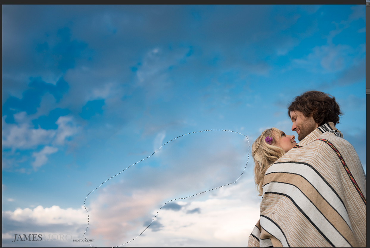
Next up in my investigation into the potentially useful new features of Adobe Photoshop CC 2014 is the new update to ALL of the content aware tools: color blending content aware. If you’ve ever used content aware move or fill on an object with a gradient–such as pretty much photo involving the sky in the background–then you’ll know that previous iterations of the content aware tools sucked miserably at dealing with color gradients and blending them. They simply left sharp, straight lines as evidence of your photoshop trickery. Now, content aware with color blending actually hides your attempts to remove distracting objects and even allows you to move clouds around the sky in a realistic indiscernible manner. Some times, that giant fluffy phalic shaped cloud is just really not helping set the mood for your romantic engagement photos. So yea: that’s just one of many reasons off the top of my head that you’d want to play around with the sky in your photos.
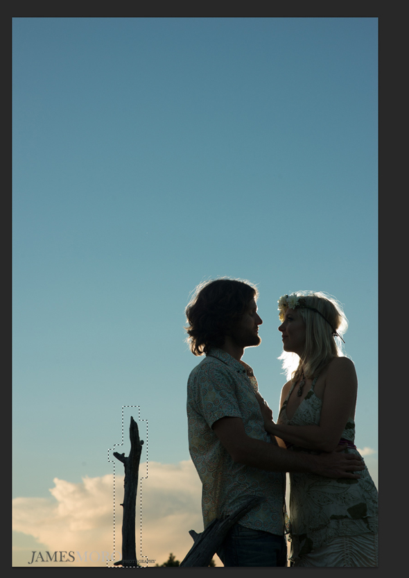
Here’s an example of trying to remove a branch against a sunset background using CS6 *note the harsh, vertical line leaving a telltale sign that the photo was manipulated*:
Before:
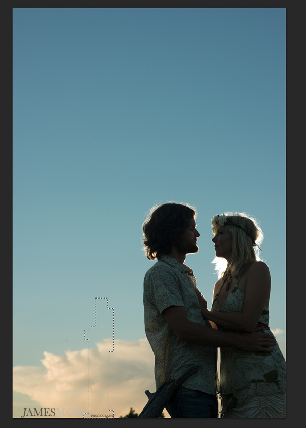
Content Aware Fill CS6 (no color blending). Note the vertical line where it failed to blend the clouds.
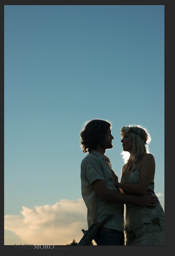
Content Aware Fill Photoshop CC 2014 (with color blending):
See how it handles the color gradient and doesn’t leave you stuck with an obnoxious line down the middle of the fill area? That’s a big improvement in my book!
Let’s see a few more examples of how it handles moving around clouds against a big sky with a sunset gradient to boot.
Before (moving the cloud selected upward):
After move:
Notice how well it blends the colors and gradients 🙂
After moving the cloud to the bottom of the frame. Notice how it picks up on the warmer hues from the setting sun. Maybe this is just a happy accident, but it’s as though the new content aware move tool recognized the cloud is in the foreground and applied the warmer colors of the foreground to it. I’m sure some of you will comment that it should’ve matched the distant background, but perhaps it was matching the predominant shapes of the foreground clouds. Either way, cool beans.
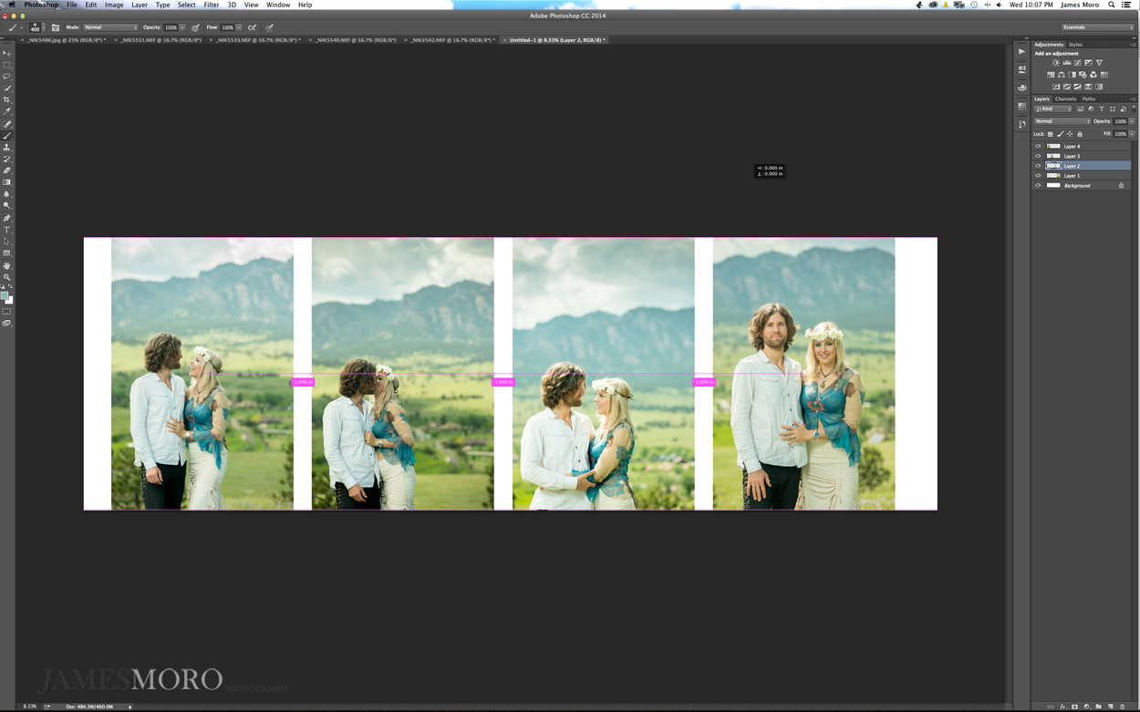
If you’ve ever designed a wedding album using photoshop templates, i’m sure you’ve experienced the frustration and challenge of making sure you have even spacing between your images. The improvements to Smart Grids in Photoshop CC 2014 (which runs automatically now instead of needing to be turned on in previous versions) goes a long way to making your album design process easier. Now you can simply alt drag a photo in a layout, and Photoshop CC 2014 will show you the distance relative to the other photos, pausing your movement when you match the distance between the other photos. It’s quick, and it simply stops your cursor so that there’s no need to finesse it those last few millimeters to balance the exact distance. Simply alt-drag a photo; then drag the other two, and it will stop you when the distance between each photo is balanced. I’m definitely stoked on this new feature, as I have to design a wedding album soon, and i’m going to have to do so without the help with album design software (blame it on the matted album companies…).
Pretty convenient trick there, Adobe. Kudos!
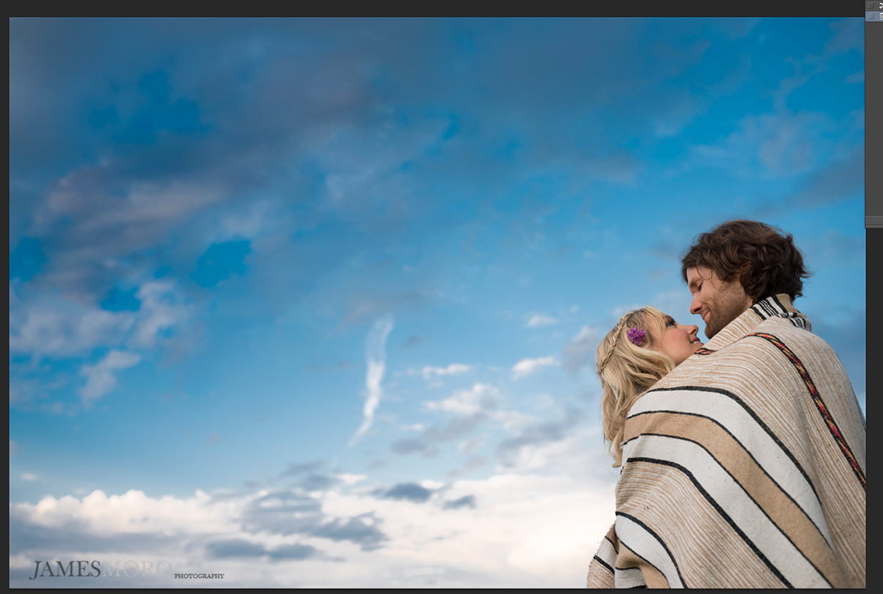
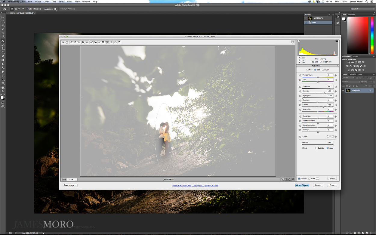
The beta version of Adobe Camera Raw 8.5 was released last week, but i’m going to include some highlights from this new update since the official version was released last night with Photoshop CC 2014. One improvement in particular is the radial brush tool, which you can now feather and control the flow of just like the standard brush tool. This essentially lets you create spotlights and highlight your couple in photos, while masking out the effect to remain INSIDE the radial selection. Likewise, simply create another radial selection the same size, apply it to the OUTSIDE, and go crazy with boosting the contrast while leaving your couple untouched.
For example: I used this to create a warm glow contained within the couple’s silhouette, while also boosting the contrast on the surrounding landscape without turning the couple into an over saturated blob of color.
Before:
Masking/feathering with the radial brush in ACR 8.5:
After radial brush edits, using an inside and outside radial brush:
I hope this review has proven helpful to you in determining whether it’s worth giving up your infinite license with Adobe Photoshop CS6 and upgrading to Photoshop CC 2014, as well as helpful to those of you trying to figure out what you just got yourselves into with the automatic CC download of the 2014 installation of Photoshop CC.
Photoshop CC was fairly buggy and, in some ways, a step back from Photoshop CS6. Sure, I was curious about the motion blur reduction filter, as well as the ability to use lightroom mobile to cull my images–those were the features that piqued my interest in switching over to the subscription plan. Having watched Adobe continue to offer it’s $10/month plan for Photoshop CC and Lighroom 5 over the past year, i’m fairly confident that going with the subscription plan is more cost-effective than dropping $250 on every annual photoshop upgrade, especially if its a minor one like the jump from CS6 to CC. Still, i’m definitely let down that Adobe decided to eliminate the Output Module in Adobe Bridge CC; so many photographers, including myself, relied on this HEAVILY in our workflow. I still believe Adobe should give us the option of adding this back as an optional installation, especially since they haven’t provided anything that replaces the features you give up by losing the Output Module in Bridge CC. I may continue to use Bridge CS6 for culling for this very reason, as I can’t imagine having to open an entire processed wedding of 800+ photos in the ACR dialogue box just to be able to export my files at the right size.
What are the features worth upgrading for?
In no particular order:
–You can use Camera RAW as a filter–instead of going back to LR or Bridge and re-editing your jpeg or TIFF as though it were a RAW file.
–Improved Content Aware tools now use color blending and gradient blending, giving you control over the amount of improvising it does versus staying true to the content (structure) and blending color gradients or ignoring color blending (color).
–Path Blur and Spin Blur tools are very much worth upgrading for if you do automotive photography or need to create motion effects in your work.
–New Smart Grid improvements make wedding album design easier by helping you to match spacing between images in a layout.
–Significantly reduced brush lag/input latency (at least until Adobe breaks it by trying to ‘fix’ something)
–Motion Blur reduction sharpening actually does work, though not in a mind-blowing fashion. But it can be used to salvage images affected by camera shake or poor decisions on shutter speed choice.
–Integration with Lightroom Mobile as a culling tool (though I still prefer Bridge for culling due to features like being able to select multiple images and check sharpness using a Loupe View on each image–at the same time).
*notice that I left out the ‘Select Focus’ tool. It’s just simply not there yet in terms of functionality*
I’m on the fence about whether Photoshop CC 2014 is worth upgrading. You don’t reap a massive amount of productivity gains, although there are several features that come as welcomed improvements depending on what you photograph and your workflow. If you’re worried about Adobe pulling an “A-HA!” and doubling or tripling the price of subscription after a year, I think you’re overreacting. Adobe has now made the $10/month ‘limited time’ Photoshop/Lightroom promotion a permanent price; I think they’ve gained so many new users via their subscription plan that they’re making plenty of money and aren’t going to turn around to triple the rates on this entirely new user base (who they attracted solely by reducing the financial barrier to entry that used to keep Photoshop strictly in the hands of professionals willing to spend $500 to $1000 for image editing software.) It simply doesn’t make sense for them to get greedy and alienate this new user base by dramatically raising prices. Still, i’m holding onto CS6 just in case 😉




comments